A New Look for Techstars
Mar 12, 2020

Techstars began with the simple belief: That entrepreneurs will build a better future.
In 2007, we launched our first mentorship-driven accelerator program in Boulder, Colorado, establishing a radically effective new model to fuel companies and innovation across a broad spectrum of companies and industries.
When new ideas take off, innovative corporations take notice and, by 2014, we had launched programs with Nike, Microsoft, Disney, and more.
Now, while many tend to associate entrepreneurship with tech centers like Silicon Valley or Tel Aviv, we believe entrepreneurship can happen anywhere. So we've worked to build out entrepreneurial ecosystems around the world, from Buffalo to Berlin and everywhere in between. And, with deep roots in venture capital, we always work to connect top investors with the most promising early-stage startups.
Today, Techstars is the global platform for investment and innovation. We connect entrepreneurs, investors, corporations, and cities to create a more sustainable and inclusive world.

The case for change
Over the years, we've seen incredible growth and success across the entire Techstars universe. As anyone who knows us knows that we're entrepreneurs at heart and have always focused more on the work and less on how we projected ourselves to the world.
But, as more and more startups, corporate partners, communities and investors reached out, asking how they can work with us, it became clear we needed a simpler, sharper, more unified way to tell our story. That's exactly what this new identity aims to do.
“Today, Techstars is an ambitious, creative, and giving company that sets the standard for entrepreneurial innovation around the world,” said Techstars Cofounder and CEO David Brown. “Having pioneered the accelerator program model, we are now working toward our vision of a connected economy of innovation.”
The line that connects
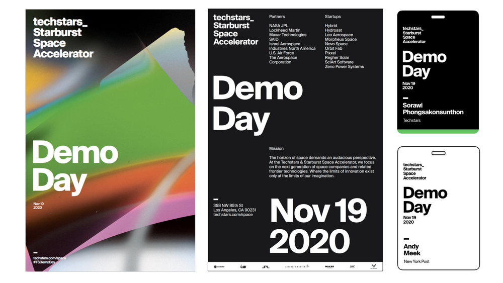
Inspired by the command line of early computer terminals, the new Techstars logo consists of a single typographic wordmark—our name, followed by an underscore (“the line”).

In the same way the command line is a text interface for computers, the new logo is a text interface for our brand. The line extends forward, connecting us with cities, industries, programs, and partners. This is both a nod to the past and a suggestion that future possibilities are wide open.
A new take on green
The glowing green command lines from cathode ray tubes inspired the key accent color of the new Techstars brand design. Phosphors are luminescent materials used in early monochrome computer monitors.
It is supported by black, white, and slate, which we use across all channels. We like the simplicity and contrast of this minimalist palette, as it creates a neutral system to display all the brands in the network.

A new typeface
The Techstars brand uses the Suisse Int’l font from Swiss Typefaces.
The Suisse typeface provides a classic yet modern style that works well for print, websites, mobile apps, and electronic publications.
A voice for all
As entrepreneurial leaders, we are passionate about helping others, eager to advocate for everyone in the network.
Our informal, friendly tone is a reflection of who we really are—an interconnected group of doers who are pretty down to earth.
A simpler approach to naming (and signage)
To ensure consistency across programs, clarity of purpose, and ease of recall, all new accelerator programs will follow our streamlined naming conventions.

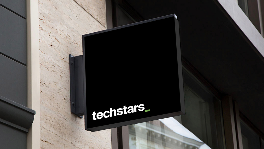
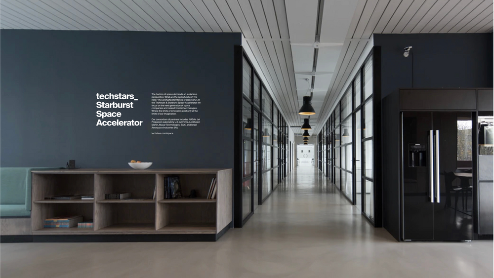
The all-new Entry Mark and Wall Mark are the first branded elements seen by members and guests at a Techstars accelerator program.
In a simple, consistent way, they establish a sense of place and let visitors know they have arrived at Techstars.
We’re thrilled to share the new Techstars brand identity, a project that reflects the input of teams across our entire organization.
